What to include on a website homepage for a service business

Creating an effective website homepage design and structure is crucial for any service business.
It’s often the first impression potential clients have of your small business, making it essential to convey professionalism, trustworthiness, and a clear understanding of the services you offer.
The objective of your services website homepage is to immediately capture visitors’ attention, provide essential information, and guide them to the next step.
This could include steps to contact you, learn more about your services, or book an appointment as just a few examples.

In this blog post, I outline the key elements that every service business website homepage should include to engage visitors and convert them into clients.
From crafting a compelling headline that succinctly describes your services to incorporating high-quality images that reflect your brand, we’ll cover everything you need to create a stand-out website homepage design.
In addition, we’ll touch on the significance of integrating a lead magnet and client testimonials, making it effortless for potential clients to reach out and learn more about you.
By the end of this guide, you’ll have a comprehensive understanding of the essential components needed to create a powerful and effective website homepage for your service business.
Whether you’re building a new website from scratch or looking to optimise an existing one, these insights will help you attract clients and make sales, ultimately driving the success of your service-based small business.
Here are the essential elements every service business needs on their website homepage:
An SEO-Friendly Headline
At the top of your website homepage, you’ll want to craft a clear and concise headline with keywords relevant to your services.
When you include keywords in your headline, Google and the other search engines are more likely to find you, and you’ll get more website traffic.
The homepage headline will also instantly convey what your business offers to your site visitors.
And it helps you to attract a qualified audience and improve traffic to your website.
RELATED: How to choose the right keywords for your target market
A Button With a Strong Call To Action
I also recommend having a button with a strong call to action in the top section of your website’s homepage, along with the headline.
This call to action could be to book an appointment or to sign up for a freebie (lead magnet) that you are offering to grow your email list.
Alternatively, you could link the call to action to one of your website’s services pages for visitors to learn more about what you offer.
I recommend a button over a link, as a button will stand out more to visitors to your site.
Not sure where to start when it comes to finding clients for your service-based small business? That’s where I can help. Get started by downloading my free Ultimate Business Building Checklist by clicking the button below:
A Professional Photo of You
Depending on your website’s homepage design, adding a professional photo of yourself at the top of your site may fit quite well.
If you don’t have any professional photos of yourself yet, book in for a simple headshot photo shoot, as this is all you will need to begin with.
You can worry about booking an expensive branding photo shoot later when you have more money coming in.
The photo adds a personal touch and builds trust with visitors, helping them feel more connected to you and your business.
A friendly, approachable image can also make potential clients more likely to engage and reach out to make an enquiry.
Brand Messaging
You should clearly articulate your brand messaging in the second section of your small business website homepage.
Your brand message is your overarching elevator pitch, which highlights your unique value proposition to differentiate yourself from competitors and resonate with your target audience.
This messaging will help establish a strong, memorable brand identity and set expectations with your site visitors for what they will find on your site.
A Summary of Your Service Offerings
Next, on your small business website, you’ll want to provide a brief overview of your key services, allowing visitors to quickly understand what you can do for them.
This summary should be clear, concise, and focused on your main service offerings.
Often, you’ll see this section with a heading such as “Here are three ways I can help you” or something similar.
In this section, you should link each service directly to the website page that promotes the relevant offer.
An About Section
It’s important to share your story, mission, and business background to give visitors a sense of who you are and why you do what you do.
This homepage section could be titled something like, ‘Meet your Business Coach’ or ‘Hi. I’m Hayley Robertson’ and will help to build credibility and a personal connection with potential clients.
It doesn’t need to be overly long because your ‘About’ page will have more information.
So, consider this homepage section a snippet of information and include a button that people can click to visit your ‘About’ page to learn more.
Adding another photo of you to the home page of your website is also helpful to let people know who they will be working with.
Not sure where to start when it comes to finding clients for your service-based small business? That’s where I can help. Get started by downloading my free Ultimate Business Building Checklist by clicking the button below:
Client Testimonials
You should showcase positive feedback from satisfied clients on the home page of your website to build social proof and demonstrate the quality of your services.
Client testimonials can reassure potential customers that others have had successful experiences with your business and encourage them to make an enquiry.
RELATED: How to use client testimonials in your content marketing strategy
Your Latest Blogs
I recommend featuring your most recent blog posts to provide valuable information, showcase your expertise, and keep your content fresh and engaging.
Depending on your website platform, you should be able to add a blog element or widget that automatically updates and displays your most recent posts in this section.
Regularly updated blogs can also help improve your SEO rankings.
RELATED: How to write a great blog post: A small business guide
A Lead Magnet
Your website homepage is a great place to promote a valuable freebie, such as a guide, checklist, or webinar, in exchange for visitors’ email addresses to capture leads.
I recommend creating a mock-up in Canva of your freebie so people can see what they will get in exchange for giving you their contact information.
Again, depending on your website and email system, you could have the signup fields (first name and email address) directly on your homepage.
Or you could include a button that clicks through to a landing page in your email system where they can sign up to receive your freebie.
RELATED: 3 Types of lead magnets that are perfect for service businesses
A Super Footer
You should design a comprehensive footer at the bottom of your website’s homepage that includes important links, contact information, social media icons, and an email list signup form.
A well-organised footer ensures visitors can easily find additional information and stay connected.
In addition, you can also add links to your privacy policy and website terms and conditions in the footer, and a copyright notice to protect your business’s intellectual property.
Easy-to-Follow Navigation Menu
Whilst this element is not specific to your website homepage, it’s important that you have a simple, intuitive navigation menu to help visitors quickly find what they’re looking for without frustration.
Clear, organised navigation enhances user experience and keeps visitors on your site longer.
Not sure where to start when it comes to finding clients for your service-based small business? That’s where I can help. Get started by downloading my free Ultimate Business Building Checklist by clicking the button below:
Images That Reflect Your Brand
Where relevant, you should use high-quality images that align with your brand’s style and values to create a visually appealing and cohesive look.
Relevant, professional photos can make your website more engaging and memorable.
BONUS TIP: Ensure Your Homepage is Mobile Friendly
A significant portion of your website traffic will likely come from mobile users.
So, ensure your website is responsive and functions seamlessly on all devices.
A mobile-friendly design enhances user experience and accessibility, helping retain visitors.
Incorporating these essential elements into your website homepage can significantly enhance its effectiveness, helping to attract and convert potential clients for your service business.
You’ll create a welcoming and professional online presence by focusing on clear communication, engaging visuals, and user-friendly navigation.
And with these strategies in place, your website homepage will showcase your services effectively and build trust and credibility with your audience.
Not sure where to start when it comes to finding your first clients?
What you need is a solid sales and marketing foundation that will give you the confidence and motivation to show up consistently and attract the ideal clients you’ve been looking for. And that’s where I can help.
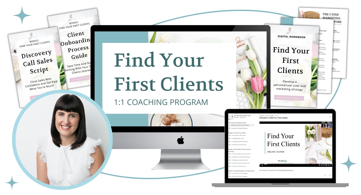
In my 12-week 1:1 coaching program, Find Your First Clients, you’ll be guided step-by-step through my Foundations First Framework, so you can stop spinning around in circles and gain the clarity you need to stand out, find your first clients, and start making money in your service business – even if you don’t feel *ready* for clients yet.

With the right strategic foundations, you can stop feeling invisible and start standing out, so you can find clients and make sales in your service business sooner.
Click the button below to find out more…
Did you find this blog post helpful? Don’t forget to PIN to Pinterest and share on Facebook.


